From the first appearance in 1939 to today’s EPIC and dark movies, Batman has managed to become one of the most popular superheroes for sure. The ability to evolve over the years is what made him survive and thrive, and it is also his logo, the famous Batman Symbol that has evolved with the character and stayed fresh and up to date with the fans.
The Bat symbol is always visible on the hero’s chest and equipment, it has changed over the years yes, and keeping track of all of the designs is not simple, but we did it. We compiled the ultimate Batman symbol post and put everything you want to know about it right here, start scrawling.
1940: This is the original Batman symbol or logo.
As you can see it looks like a man in a cape and not an actual bat. A bit bulky, but fits the time period, back then he was actually wearing a costume and didn’t have the high tech armor like today

D.C. Comics & DeviantArt/JMK-Prime
1965: This is an updated version of the original batman symbol, it looks like a bat in the middle of a flight and not like a costumed man

D.C. Comics & DeviantArt/JMK-Prime
1966: This batman symbol is the well known logo from the TV show with Adam West, it was used to zoom in and out over a spinning background during transitions with the famous tune of Ta Na Na Na Na Na Na Na.

1973: Taking a step back for some reason, you can see this batman symbol has really long ears ( why? ) and it again looks like a man in a costume and not a real bat.

1977: The ” New Adventures of Batman ” it was the first Batman animation and this bat symbol is an update of the 1966 batman logo. It has been said that the success of the TV show has brought in new fans that were familiar with this style of logo as it appeared on screen.

1983: This Batman symbol was created for the comic series ” Batman and the Outsiders. ” You can see it has a solid bottom instead of the normal spaces the older logos had. A bit more bulky and tough, but more intimidating

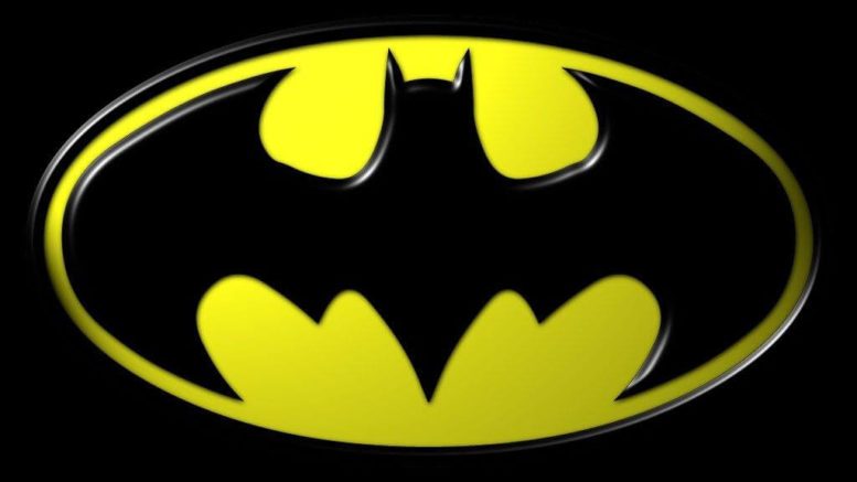
1989: Maybe the best batman symbol ever created, this was for the Tim Burton take of the Batman, which didn’t disappoint. Notice the bottom edges and the sharp curve of the wings, very well done
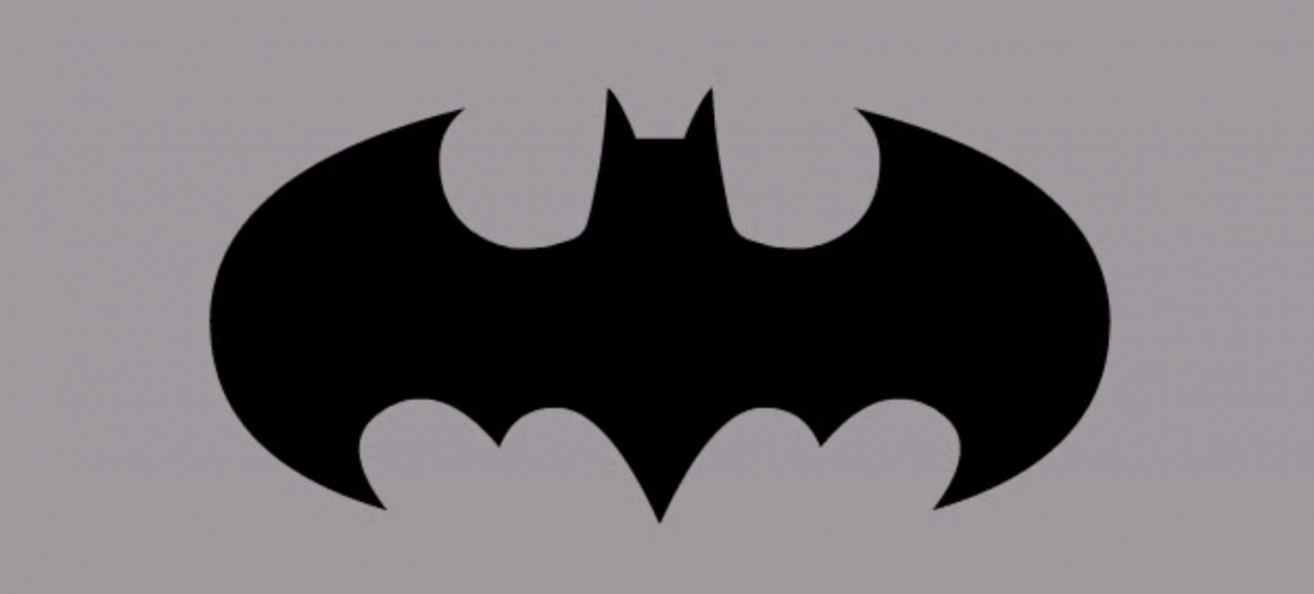
1989: Less of a bat shape to this logo. It was seen on ” Legends of the Dark Knight. ” Notice the sharp points replacing the curved in the last symbol, also the rectangular wings, looks more like a plane than a bat right?

1992: The most familiar batman symbol for sure, it was introduced in ” Batman Returns ” and you can see it is well balanced and and great improvement from the past. This logo was used a lot during the 90’s

1993: The most unusual batman logo definitely. It’s from ” Knight-fall ” comic series and it sure is stand out from the rest of them right? Notice the really curved wings, this is a shape we never saw from the Batman logo before or since.

1995: Similar to the 1992 design, this bat symbol is from the movie Val Kilmer did ” Batman Forever. ” It’s pretty neat and balanced but the movie was pretty bad in all opinions so it will forever be remembered as such.

1995: The man in the bat costume is back, for some reason, 22 years after they redesigned the batman symbol again with long ears and looking more like a person with a cape than a bat. This was from the ” Batman Chronicles “comic.

1997: Introducing Robin, this logo was used in the movie ” Batman and Robin ” and they sure gave the side-kick a really bold place on the symbol. A bit overdoing it IMO but Robin fans were sure glad.

1998: Pretty same version like the last batman logo. The wings are a little bit less boldly but it sure is looks like a real bat than before.

1999: I don’t know what happened here. It’s ridiculously squarish, not curved at all. The wings….forget about it. Next please.

D.C. Comics & DeviantArt/JMK-Prime
1999: Now you got it! This is from the ” Batman Beyond. ” This batman symbol is sleek, distinct and simple. Looks different from any other design in a good way and totally pulling it off. Nice job!

D.C. Comics & DeviantArt/JMK-Prime
2001: From the video game ” Batman: Vengeance. ” Looks like the designers wanted to play it safe after the previous futuristic logo.

2003: From the ” Batman: Gotham Knights ” series. This bat symbol is a classic. Simple, looks like a real bat and very recognisable.

2003: From the ” Gotham Knights ” this design have a very cool shape. It’s a modified version of the 1992 logo and it works really well.

D.C. Comics & DeviantArt/JMK-Prime
2004: Flashback Tuesday. Looks like it was inspired by the 1995 design and also from the 1989 Batman symbol. The bottom part kind off ruins it for me but overall it’s pretty well done.

2005: From ” Batman Begins,” This bat symbol is a modern, simple, sharp and just a classic logo for the first of Christopher Nolan’s iconic trilogy. Maybe the best one of them all.

D.C. Comics & DeviantArt/JMK-Prime
2007: Created for the ” Batman and Superman vs Alien and Predator ” ( Stupid title ) comic. The design is supposed to combine the predator logo and the batman symbol. Looks strange and doesn’t really work, just like the long movie title.

2008: Bringing back the original 1940 logo but with some small changes. Still looks bulky and for people who didn’t know the original symbol, it probably looked really weird. it was used for the ” Batman: the Brave and The Bold,” animated series that had a similar retro feel.

2008: From ” The Dark Knight. ” This Batman symbol is pretty much the same as it was in the first movie by Christopher Nolan, and rightly so. Looks awesome!

D.C. Comics & DeviantArt/JMK-Prime
2009: Instead of overlaying the two symbols of Batman and Robin, this time in ” Batman and Robin ” comic series they used a much wider, sharper wings. An improvement you will agree.

2009: Maybe the worst design of the Batman, it was made for the ” Battle of the cowl ” comic series and you can see right from the bat ( pun intended ) that this logo is off. The wings are short and small, everything just doesn’t work with this symbol. Move on

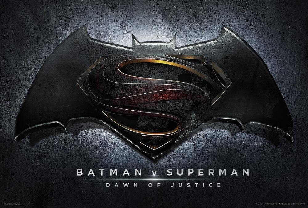
2016: The latest design of the ” Batman vs Superman” movie. It’s not the best they ever had but its ok, they had to leave a lot of room to accommodate for the S of Superman.

D.C. Comics & DeviantArt/JMK-Prime
Here it is with the full graphics:
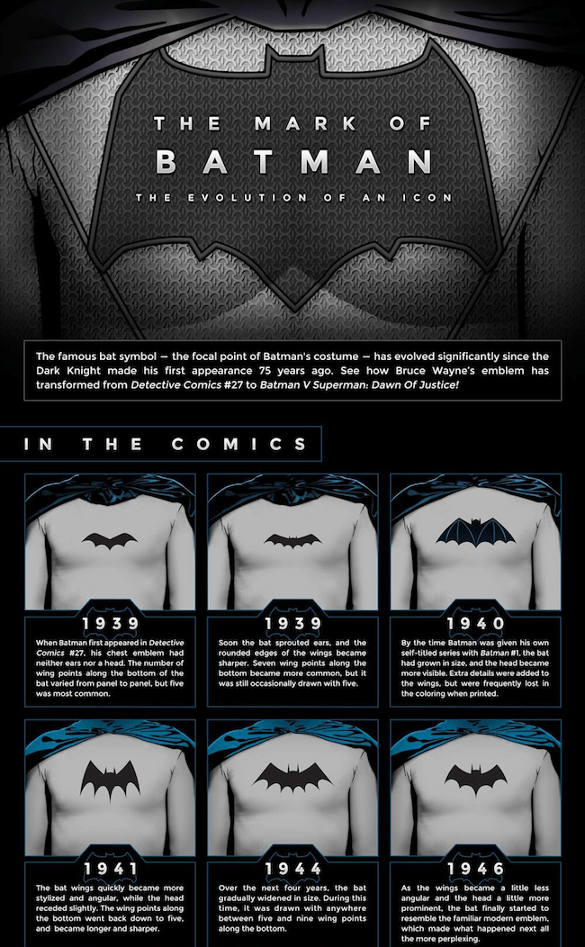
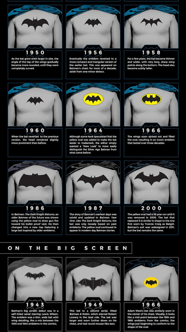
Now after you read all this, if you want to cut corners and just have a quick look of the Batman symbol over the years without any reading, here is the TL;DR version. It’s just an infographic showing them all:
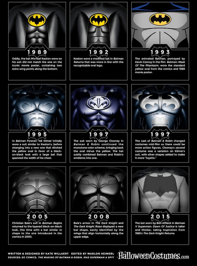
For those of you who not only want to know the history of the Batman symbol but really want to get their hands dirty, here is a short and simple video explaining how to draw the Batman logo yourself:
And last but not least, for the really hardcore fans, in the link below you can actually buy some of the cool Batman logo designs you saw in this post: check it out here
Did we miss anything? If you think we did, please tell us in the comments below.



Leave a comment