Some basic history of the Spiderman Symbol and character
Spiderman is a superhero created by Stan Lee and writer-artist Steve Ditko way back in the silver age of comic books in 1962. Published under the Marvel Comics brand, Spiderman and the Spiderman symbol made their first appearance in the comic book called Amazing Fantasy #15. Since than it is easy to say that the Spiderman Symbol or logo is one of the most recognizable in the comic book world and in the world. Spiderman the character is ranked at the top most popular superheroes such as Batman and Superman which have millions of dedicated fans and followers around the world, mostly young teens. The Spiderman symbol is hugely popular all over the world and has been the subject of tattoos, jewelry, posters and t shirts sold to millions of people every year until this very day. The logo has changed over the years since its creation and we will detail the changes of the spiderman symbol in the gallery below:
Some design elements of the Spiderman Logo
The Symbol is on his chest at all times, you can clearly see it whenever he comes into action ripping his shirt to save the day once again. One thing to notice is the fact that the symbol is always well crafted and clean which might symbolise the fact that Spiderman has a higher sense of dignity and responsibility to protect the world.
Basic shape of the Spidy symbol
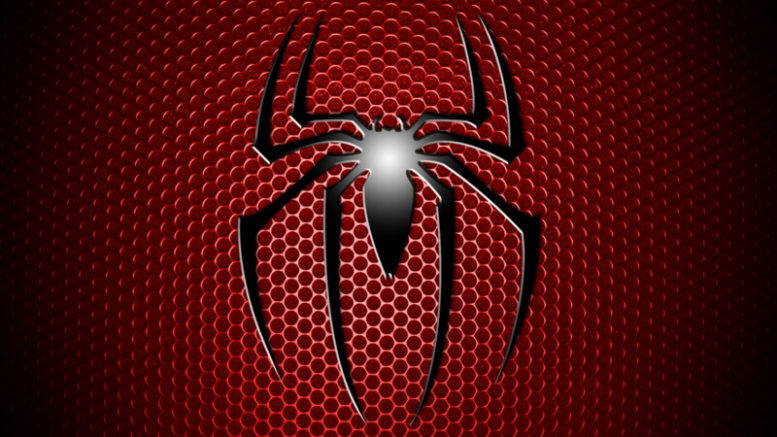
The logo clearly symoolizes the character’s abilities such as : Agility, integrity, power, speed and supernatural abilities. It consists of a spider with a web in the background.
Dominate colors of the Spiderman logo:
The red background in the Spiderman symbol shows the superhero vigilant nature, add to it the silver grey and black colors of the logo that totally enhances the elegance and appeal.
Fonts used in the Spiderman sign:
It’s pretty rare to see lettering used in the logo, but if they do use some its almost always the plain italicized.
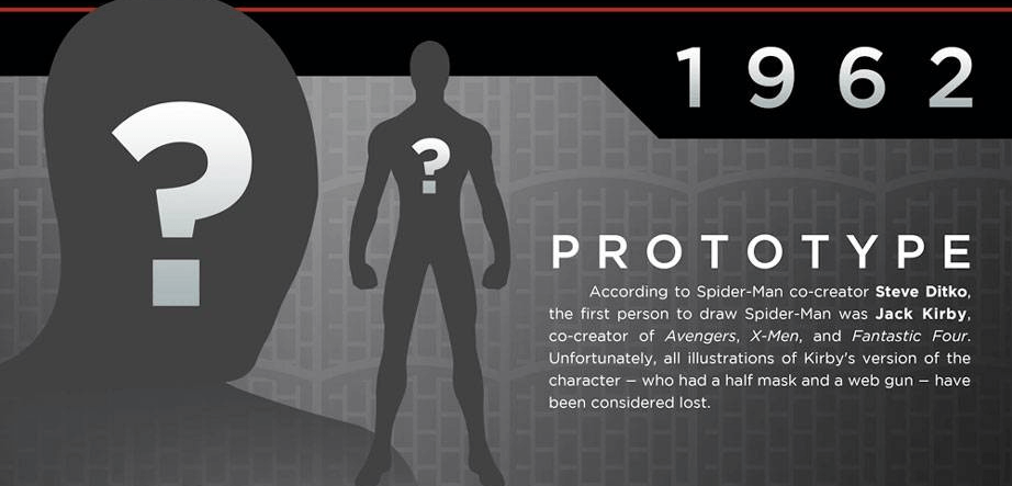
Spiderman Symbol created in 1962
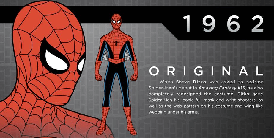
The original design Ditko create in 1962
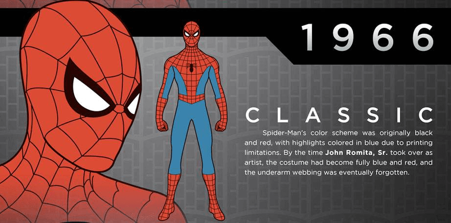
1966 is the most classic character design we all know
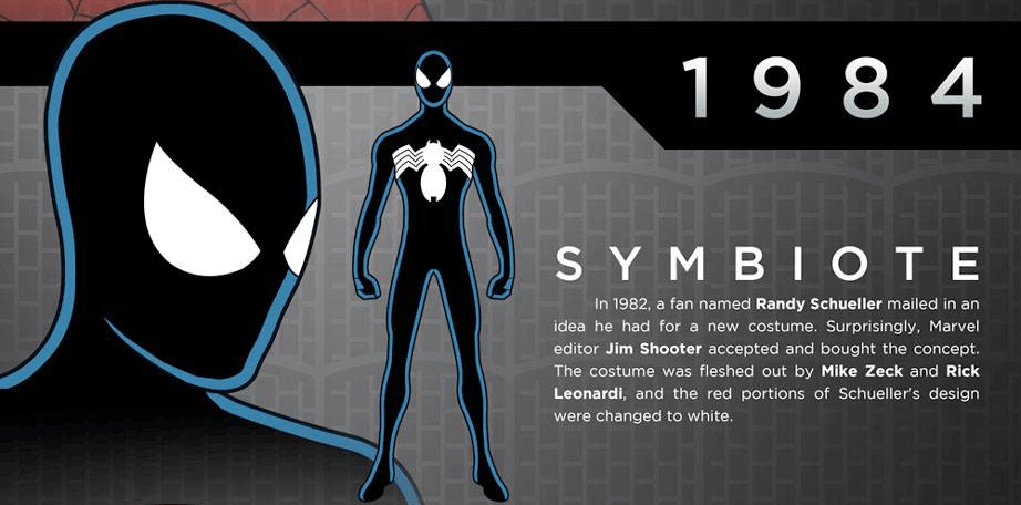
In 1984 a fan suggested an alternate design that surprisingly got accepted
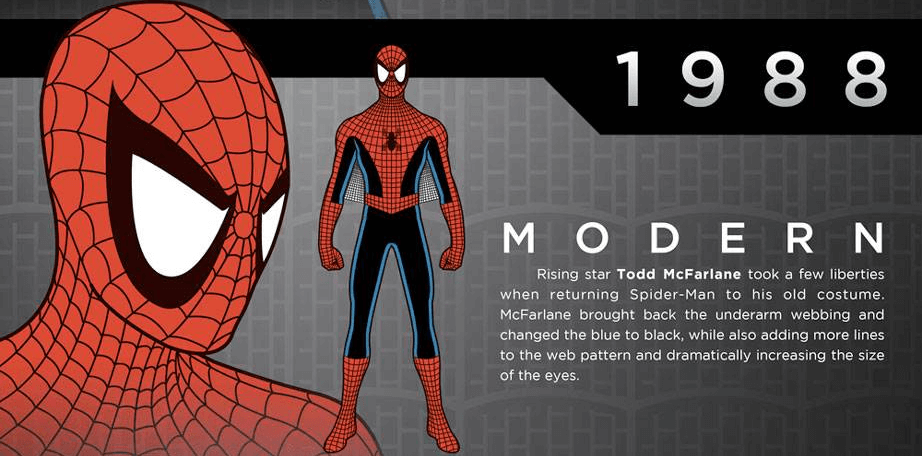
In 1988 the Spiderman symbol and character design returns to its more classic look with big eyes and more lines of web
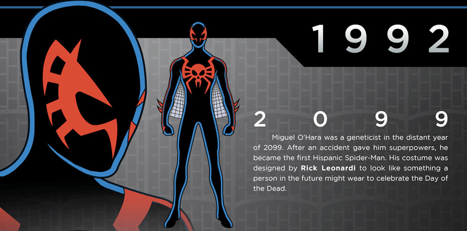
A shot in the dark with this logo design, this is what the Spiderman would look like in 2099 ( maybe )
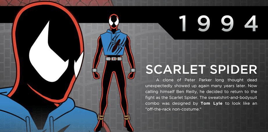
This is not exactly the Spiderman, but a clone of Peter Parker called Ben Reilly
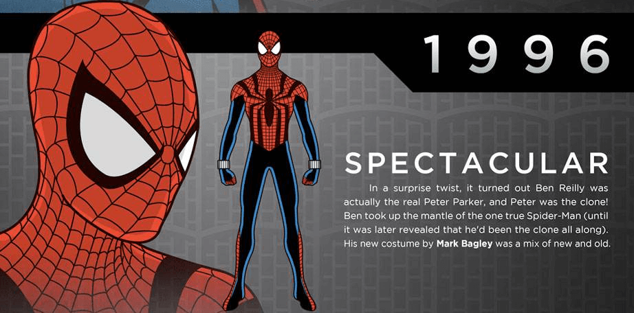
In 1996, a plot twist where it was discovered that Ben Reilly was the real Spiderman all along!
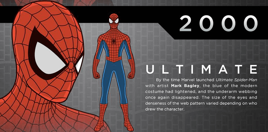
In 2000 the Spiderman symbol and character has settled to the more classic design we still see today
2002, things get serious as this design was chosen for three movies
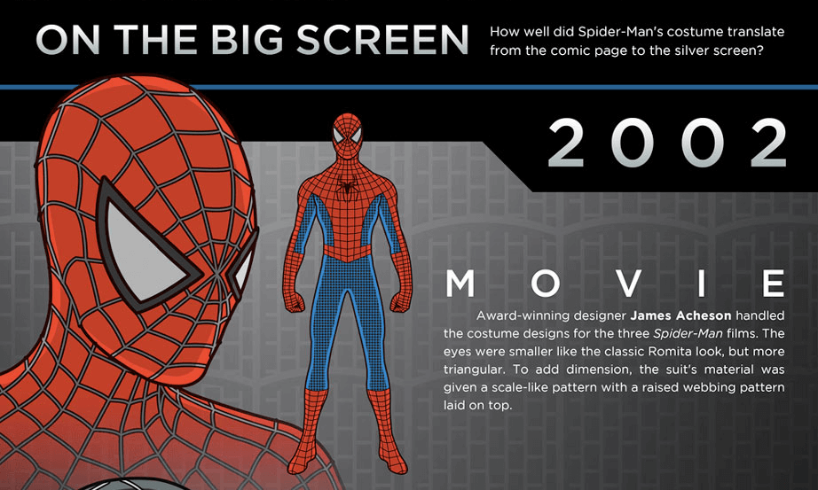
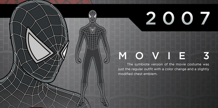
2007, slightly modified chest symbol and colors
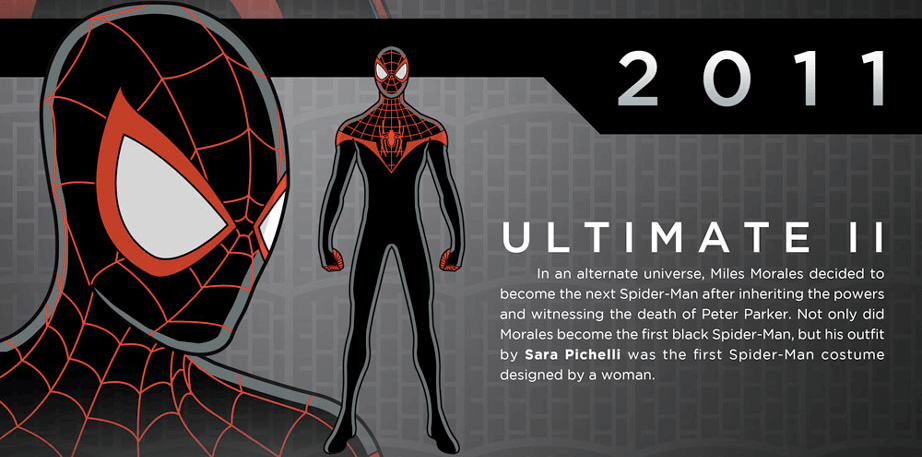
2011 – the first black Spiderman, yeah thats right! Bet most of you didn’t know this
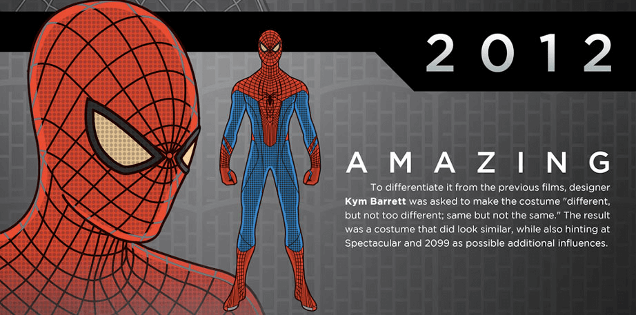
2012, continuing on the same line of the design, only bigger and more
2013, another plot twist where Peter Parker dies and Doc Ock takes his body ( what? Crazy! )
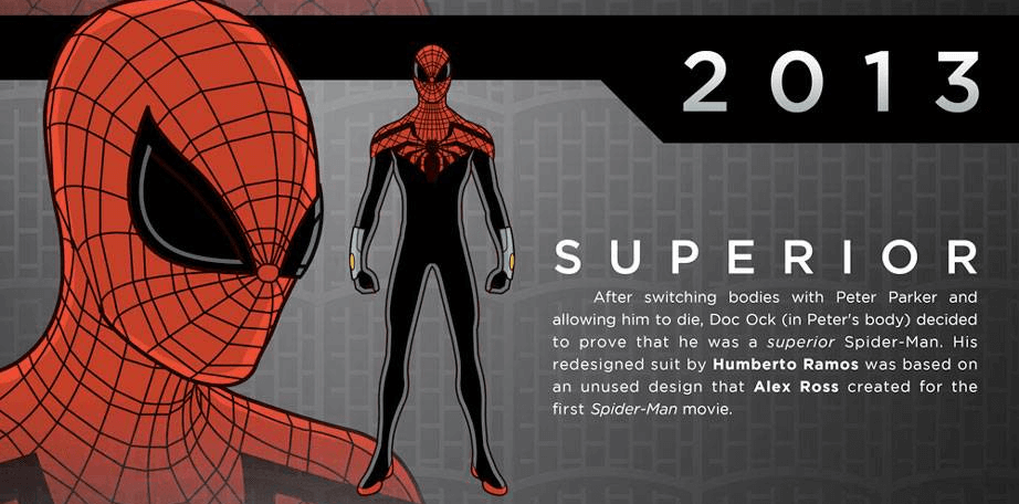
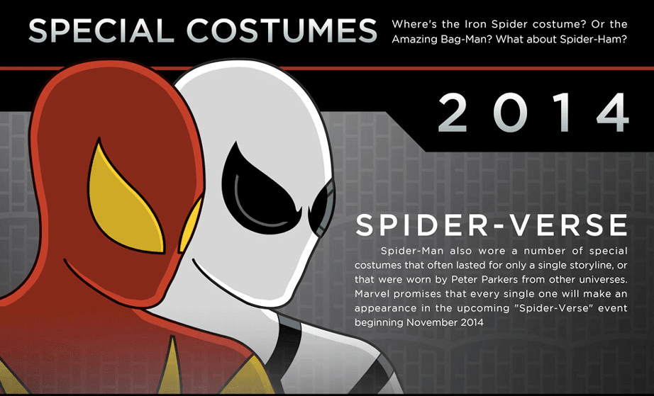
2014 – special edition Spiderman costumes and symbols
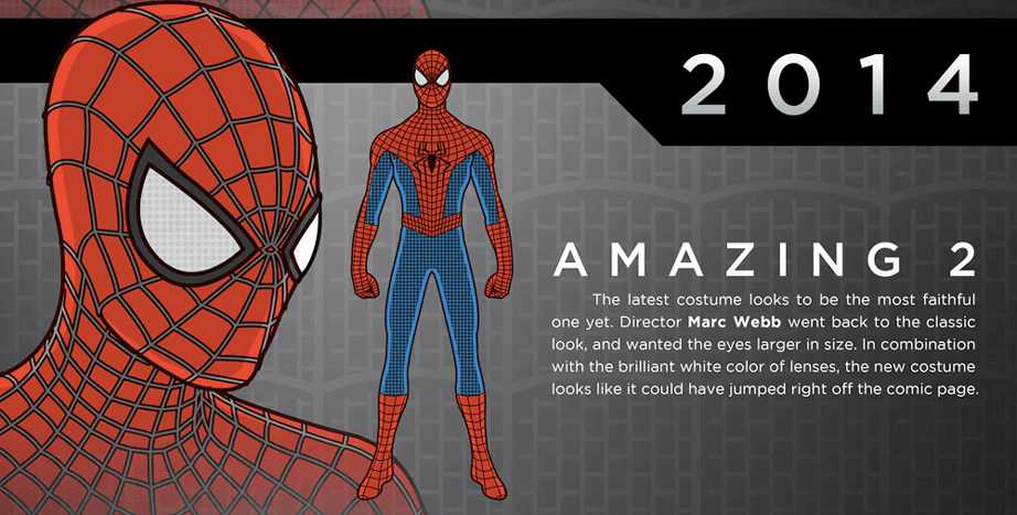
2014 – going back to the classic, and possibly the best design
Here is another detailed infographic showing Spiderman Costume designs and symbol designs over the years:


Here is a video teaching you how to draw the Spiderman famous Symbol:
Did we miss anything? I think we delivered. Please share with your friends.



Be the first to comment on "The Spiderman Symbol – Everything You Want To Know Is Here"